Son An Cafe
Logotype & markScope of work
- Logotype & mark
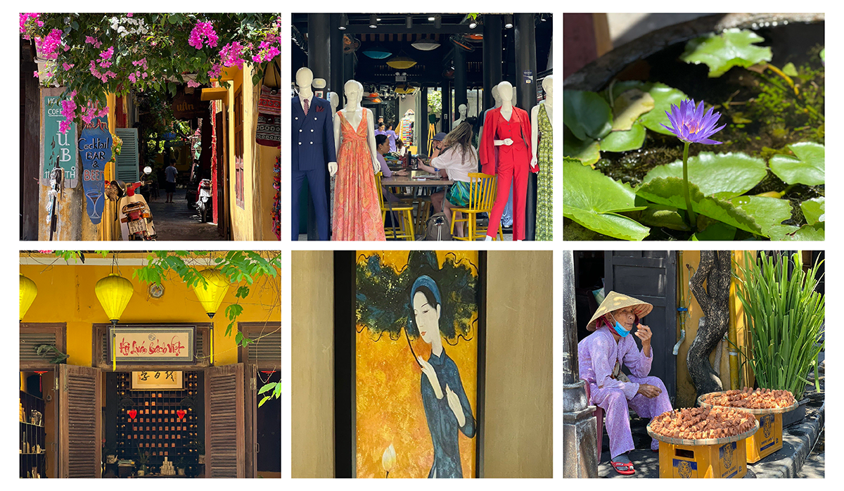
A coffee shop in Hoi An Ancient Town. Preserving the “sac son” of a Hoi An girl.
Team Gac Sao met Ms. Lan (owner of Aimee Coffee business – the predecessor of Son An) on a summer day in June 2023. Aimee Coffee has lived in Hoi An for many years and met many tourists. However, to expand the local customer base and leave an unforgettable mark in their minds, Ms. Lan conducted the rebranding process. And so, we have the opportunity to participate in this project with the mission of “changing a new look” for the brand.
The journey of understanding and defining the master brief
After starting the project, the first thing that Gac Sao must pay attention to is learning about Ms. Lan, the brand, and the “living environment” of the brand. Because we always believe that “Understanding Right Will Do Right” To do, we surveyed and researched after finalizing the project timeline.
Hình ảnh team Gác Sao đi khảo sát thực tế
Ms. Lan’s request is a vital brand, which has a story, personality and deep meaning. After obtaining accurate information through the brand survey questionnaire, Gac Sao had a detailed brief and proceeded to create the following items: giving a new name to the brand; branding guideline (story, image, personality, brand language); logo and brand identity system.
Creative process & results
New name: Son An Café – Slogan: Sac Son Hoi An
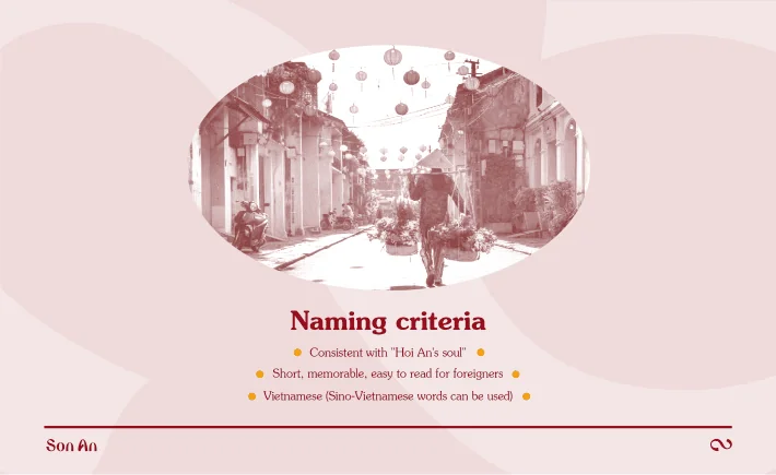
Naming criteria
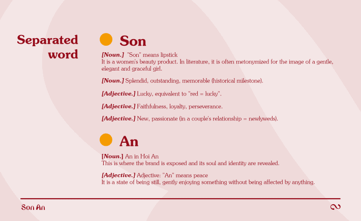
Separation of meanings "Son" & "An"
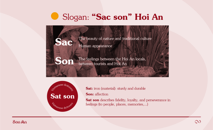
Slogan
Brand story and separation of meanings


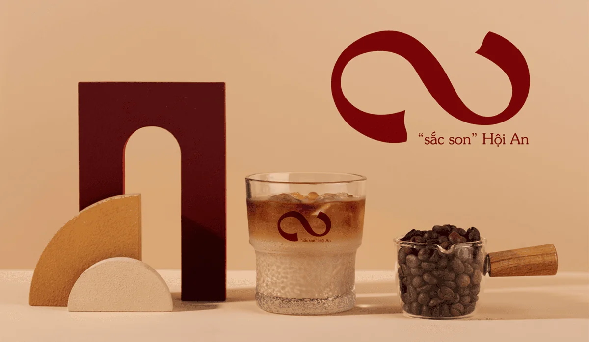
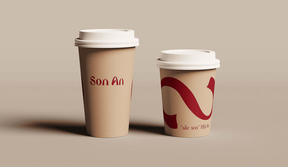
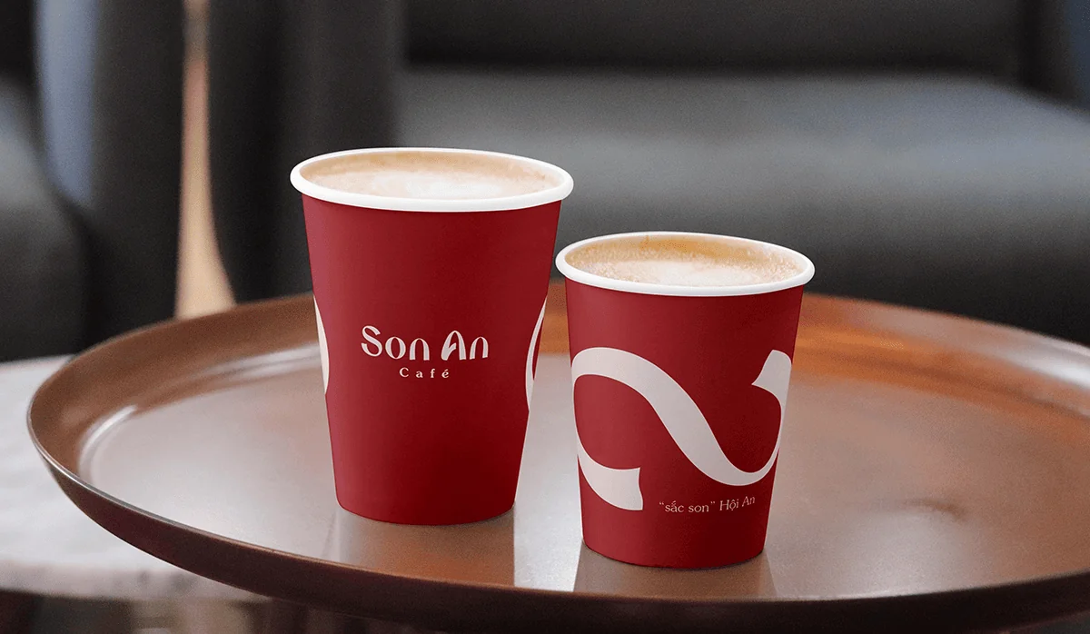
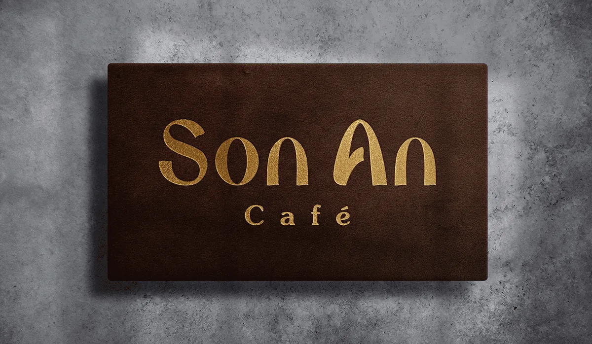
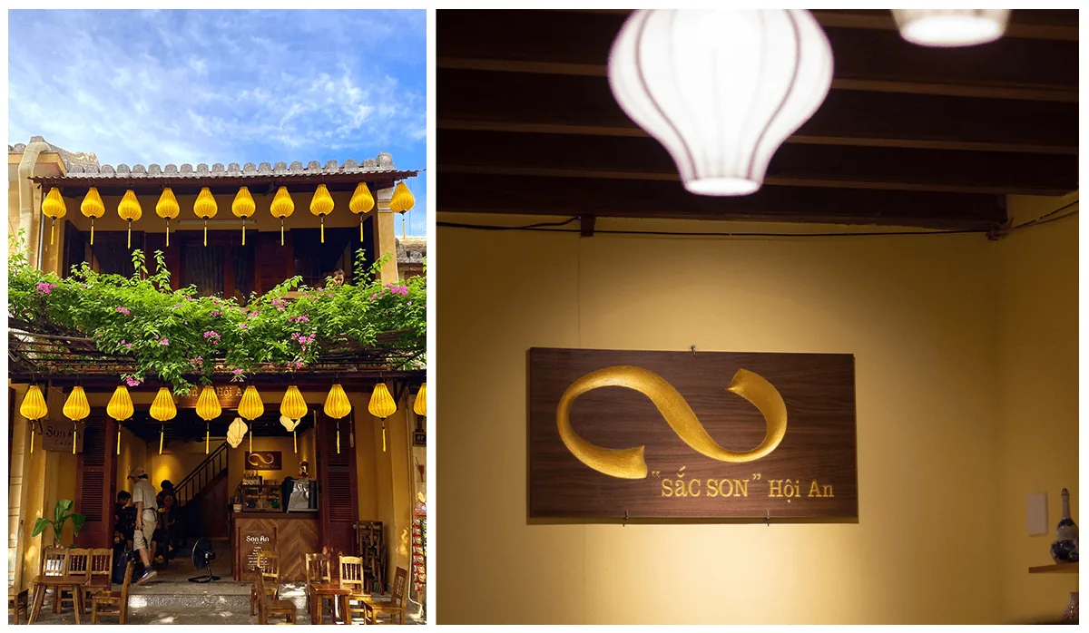
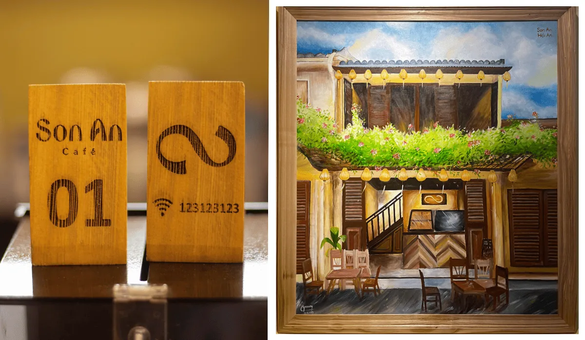
Logo
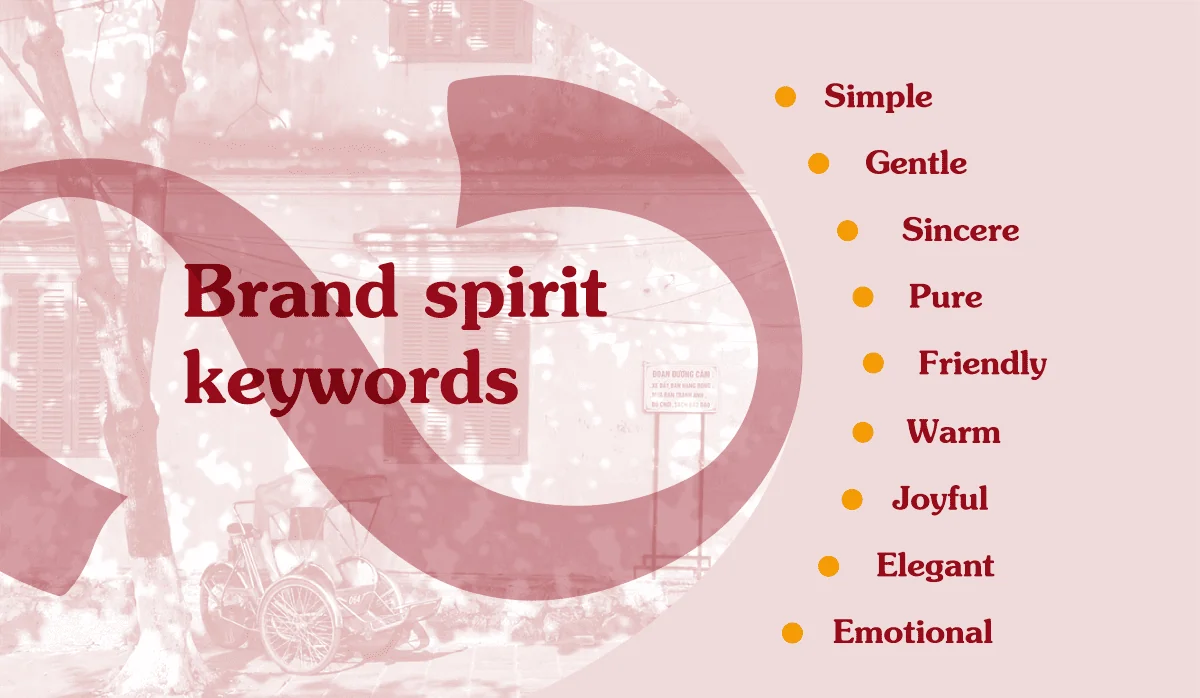
Brand spirit keywords: Simple, joyful, sincere, warm, friendly, pure, emotional, elegant, gentle
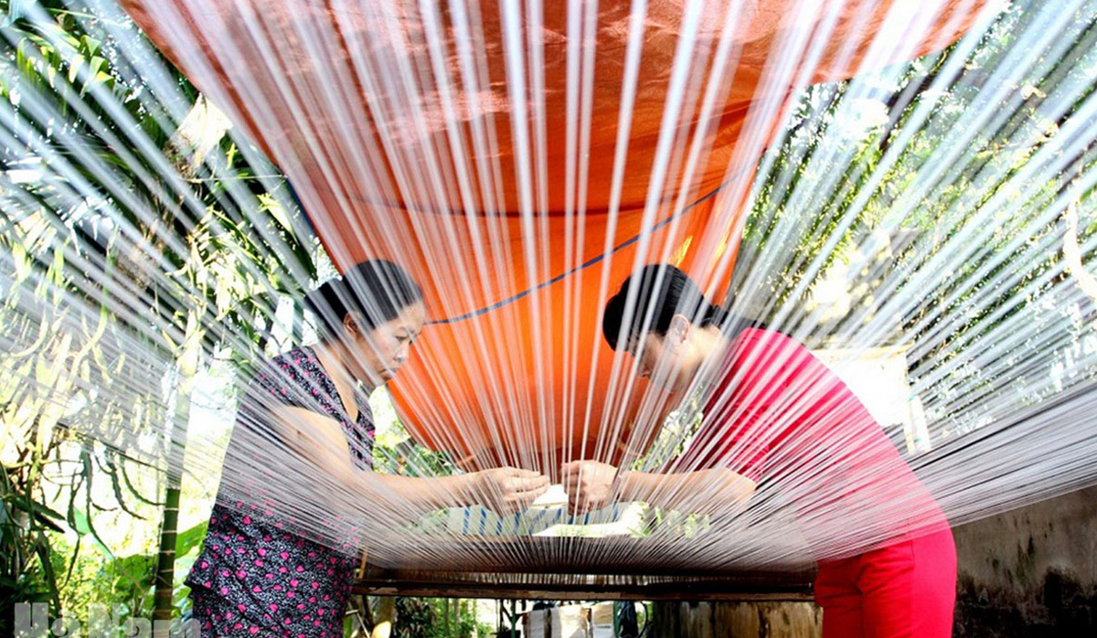
Son An Café lives in the middle of a city with many cultural values, including the beauty of traditional craft villages. And mulberry growing, silkworm raising, and silk weaving are the main sources of inspiration for Gac Sao in creating the logo.
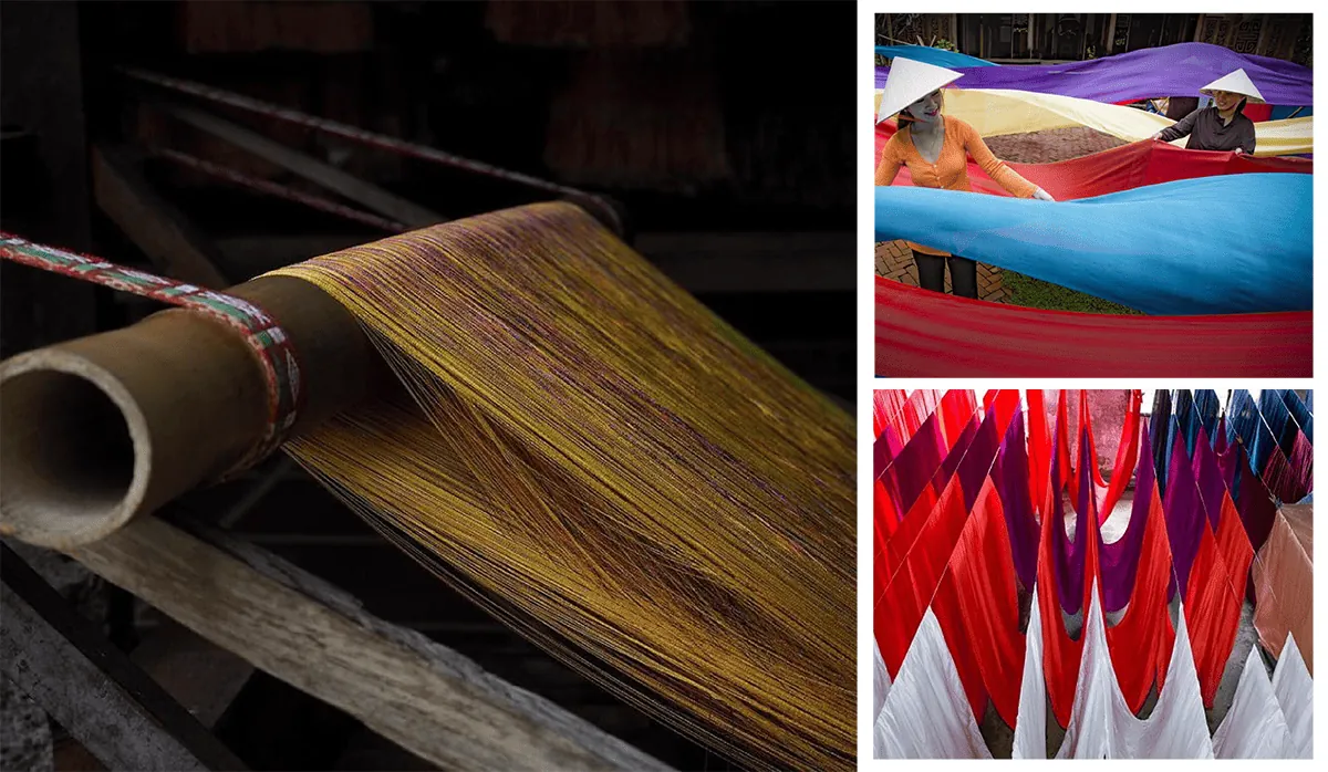
The lettering in the logo is very soft, stylized from the lines of the silk ribbon, which creates the pride of Hoi An people
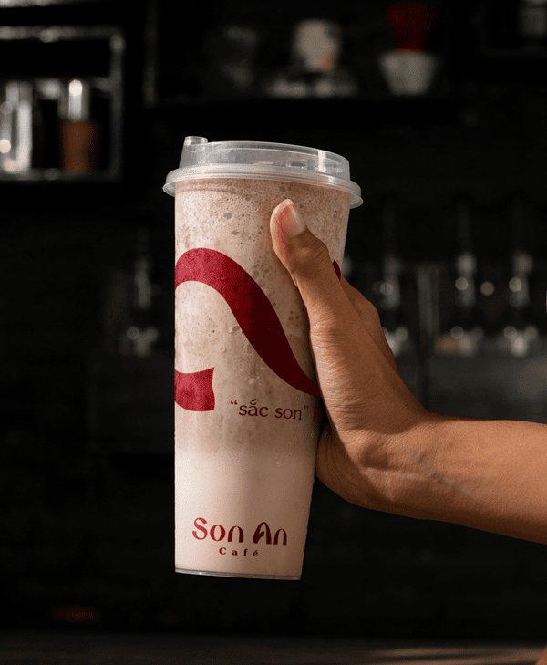
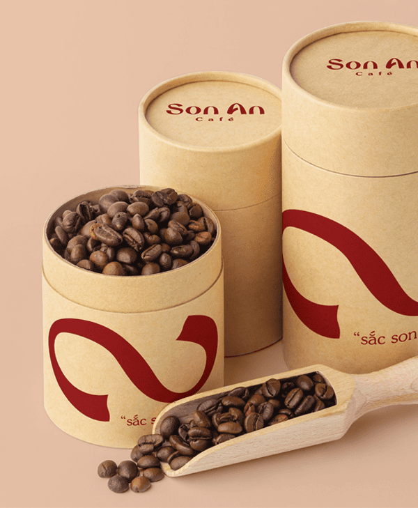
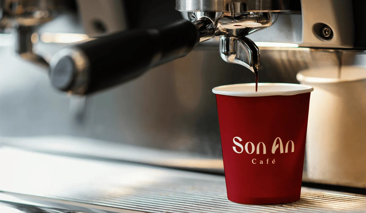
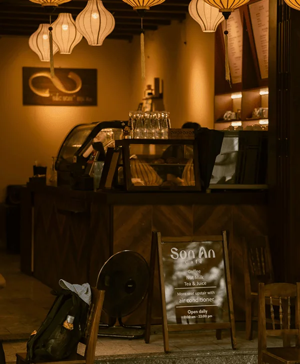
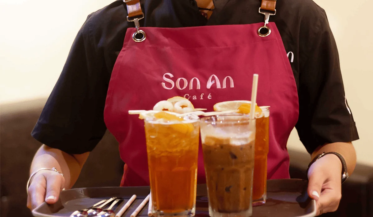
Applying the outcomes

Feedback from Ms. Lan
“I really like the story and soul of a girl named Son An – very close and lovable, exactly like the personality of the people of Hoi An. The designs are all very impressive and are implemented stably and effectively at the coffee shop. Thank you team Gac for their very dedicated advice and explanation.”
Project by
Design Team: Vũ, Hiếu Nghĩa
Branding writer: Kỳ Duyên

