Vang Nau – Cakes & Dessert Café
Logotype & markScope of work
- Logotype & mark
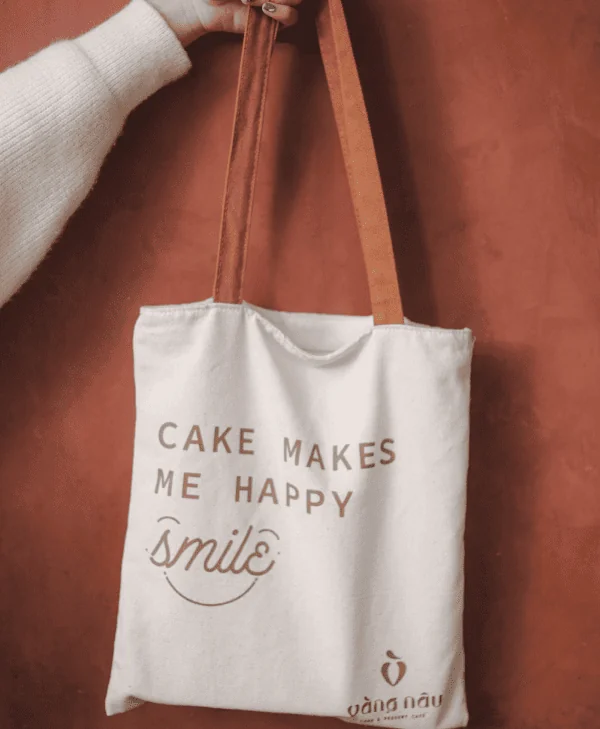
- Prints
- Visual identity
In 2017, Vang Nau cake studio was born with dedicated cakes. With investment in flavor quality and creative decorations, after 4 years of operation, from a small bakery Vang Nau has become one of the most popular cake brands in Da Nang. At the end of 2022, Ms. Hue Man (Founder of Vang Nau) conducted rebranding with a new vision: expanding product lines and potential customer segments. And, Gac Sao had the opportunity to accompany the brand in redesigning the brand identity system.
Challenge
New direction
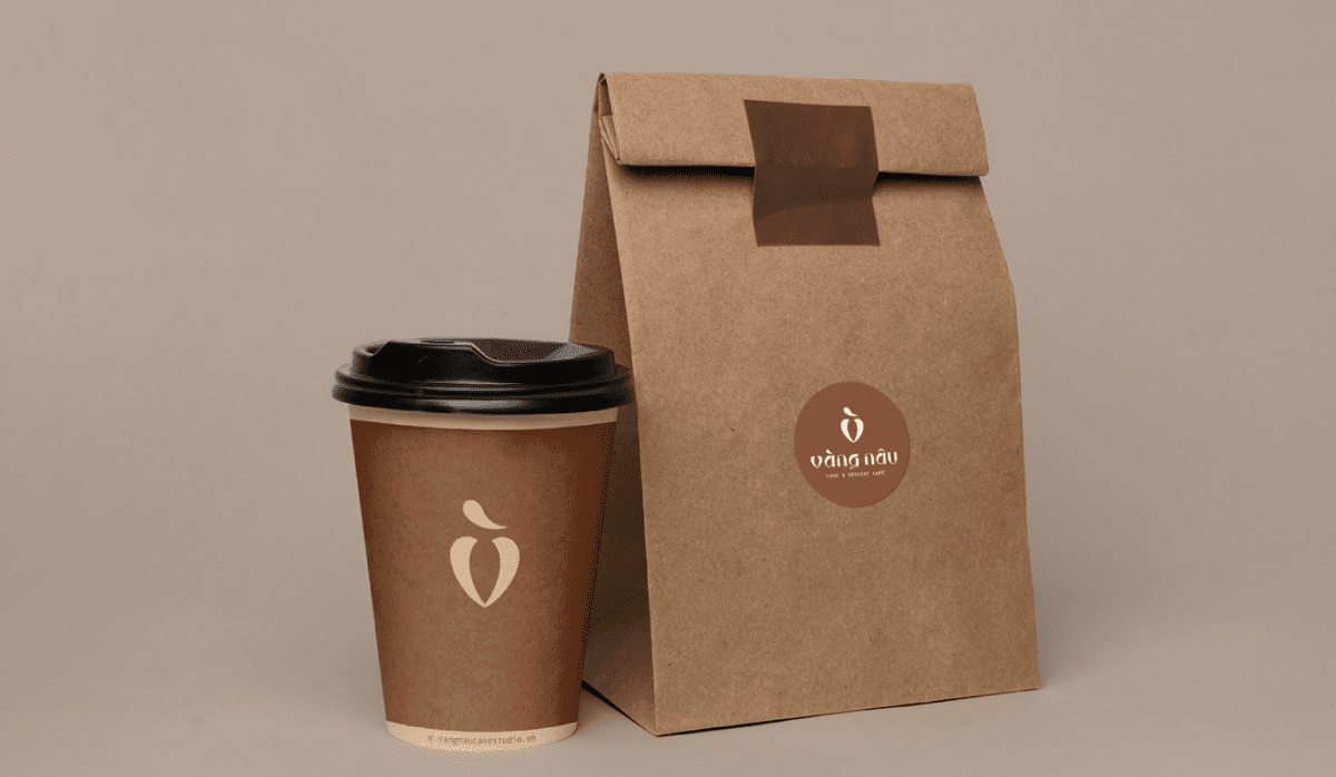
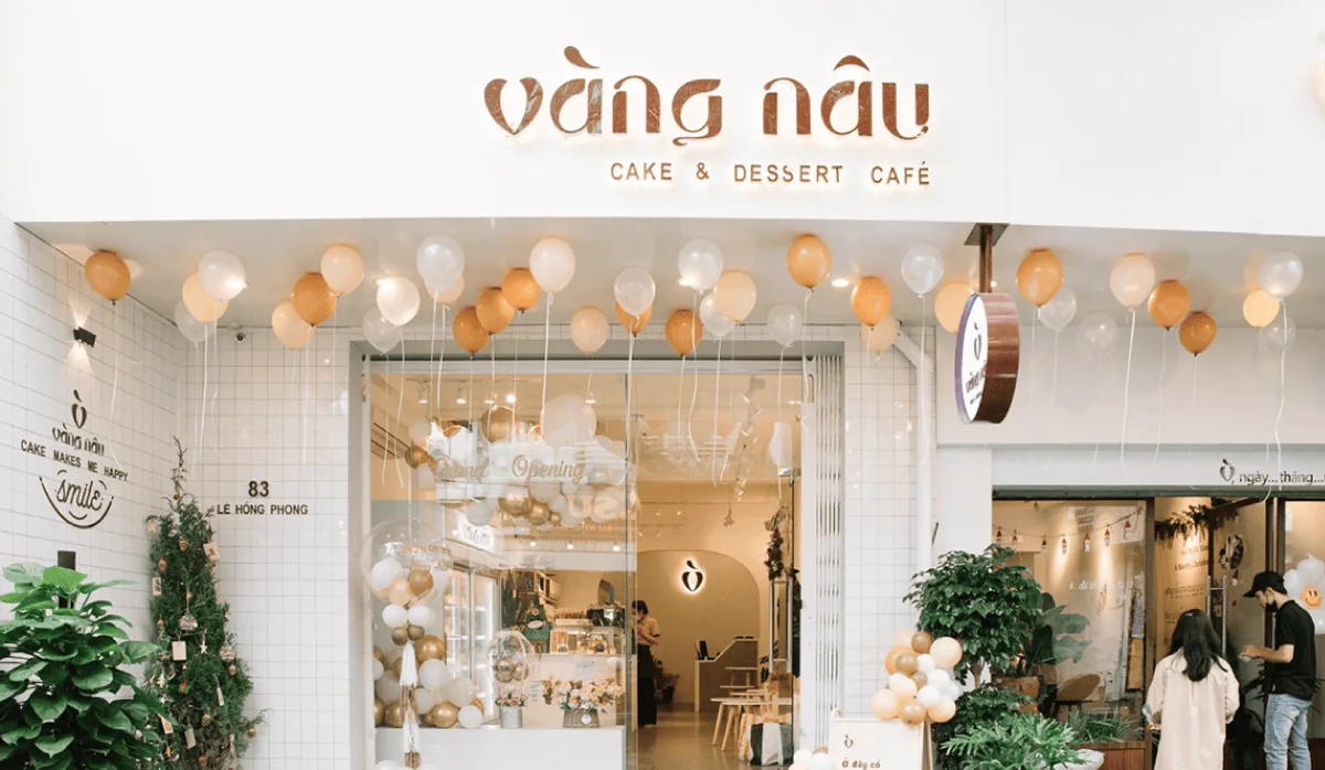
In addition to developing more pastry products, Vang Nau will serve more coffee and drinks to customers in a new space. For this new direction, Vang Nau needs a consistent identity system that can highlight core values and make an impression in the minds of customers.
Retain core identity elements
The inherent brand image in customers’s minds.
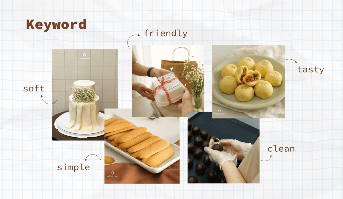
Before designing, Gac Sao had conversations with the brand’s founder to understand more about the brand’s personality and values. We found that Vang Nau in customers’ memories is still a friendly bakery with creative decorations and scrumtious flavors from high-quality ingredients. With this strength, we have noted important keywords: friendly, close, creative and gentle
The identity factors
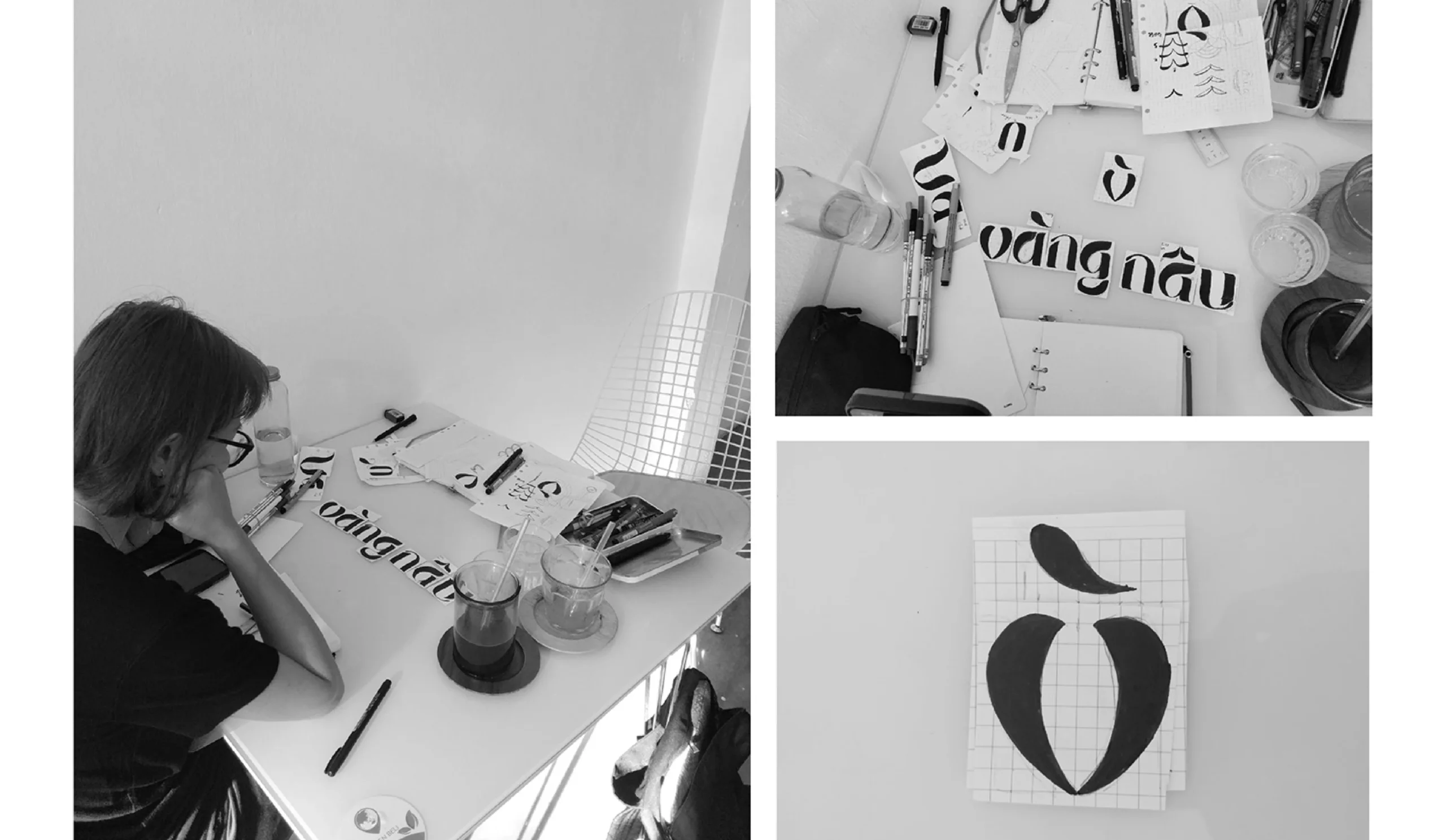
Previously, Vang Nau only had two unique identifying elements: Name & Logo. Before designing a new logo, Gac Sao reviewed three previous logo versions of Vang Nau
Creative process
Keyword
From inspirational details to stylized patterns
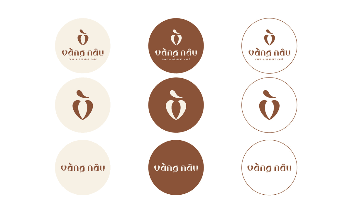
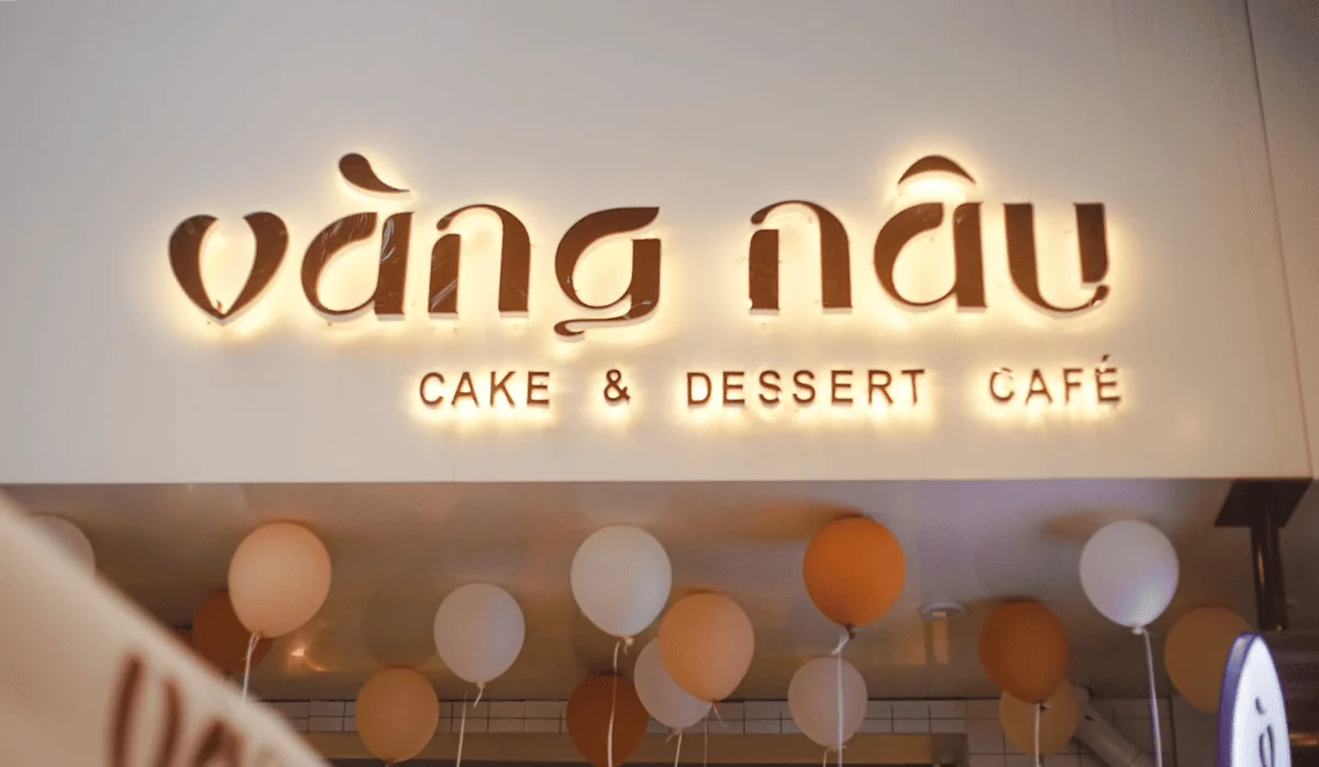
Logotype
- Cream top and chocolate flow: the flowing form of chocolate and beautiful cream top can only be created when two requirements are met: good ingredients & standard baking techniques. These two detailed images represent the quality of ingredients and baking skills of Vang Nau. These details are included at the beginning, intersection and end of the letters to not only create simplicity, softness but also taste stimulation
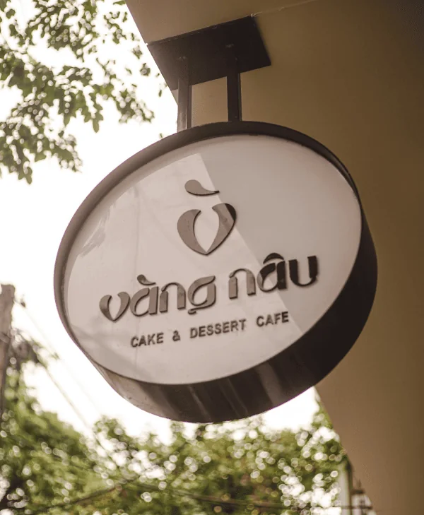
Logomark
- The letter V is the starting of the name Vang Nau. Gac Sao designed the letter V with soft and balanced lines. Looking closely, you will see that the letter V is a gradually rounding heart shape – representing a Vang Nau which is always dedicated and constantly striving to win the hearts of customers.
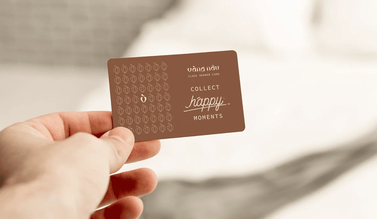
- Fireworks: cream cakes and small fireworks always join together in joyful and memorable celebrations. This detail partly reflects Vang Nau’s mission in happy moments. That’s why, Gac Sao used the image of cheerful fireworks to create a mark “huyen” in the logomark.
All these details always express the spirit of the brand: creativity, happiness and excitement.
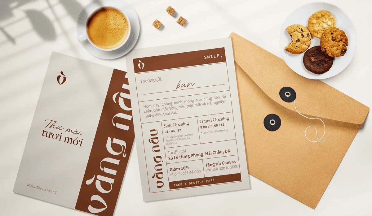
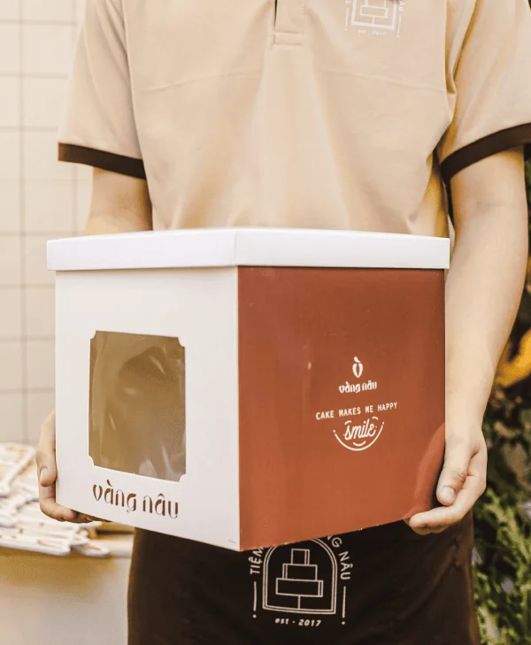
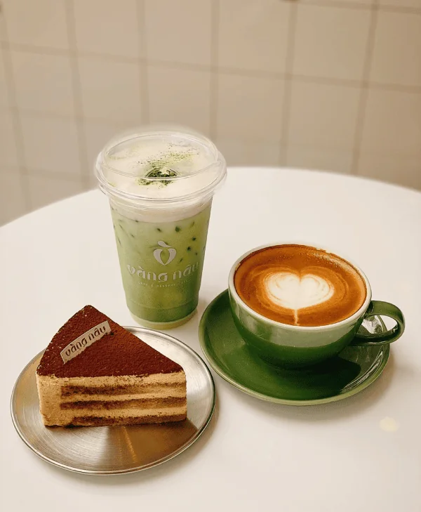
Results & design applications

Project by Gac Sao Branding
Thank you for watching!

