NIKA Cosmetics
Logotype & markScope of work
- Logotype & mark
- Packaging
- Prints
- Visual identity
Nika là hệ thống cửa hàng cosmetic số 1 Đà Nẵng
NIKA Cosmetics is one of the leading businesses in distributing genuine high-end cosmetics and perfumes based in Da Nang. Nika provides many product lines such as: cosmetics, makeup tools, perfumes, scented candles and other beauty care products.
After a long time operation and being loved by many customers, NIKA began to enter the phase of expanding its scale and positioning its brand to serve customers more comprehensively than their competitors in the market. And Gac Sao had the opportunity to accompany Nika in brand identity design.
Challenge
New vision
In addition to providing beauty care products, NIKA also aims to advise customers on health and beauty from deep inside within using natural and stable methods. With that orientation, NIKA has set the goal of developing into a beauty care company with specialized fields such as manufacturing and distributing high-quality cosmetics and spa services.
Find out thing called “we don’t know what we don’t know”
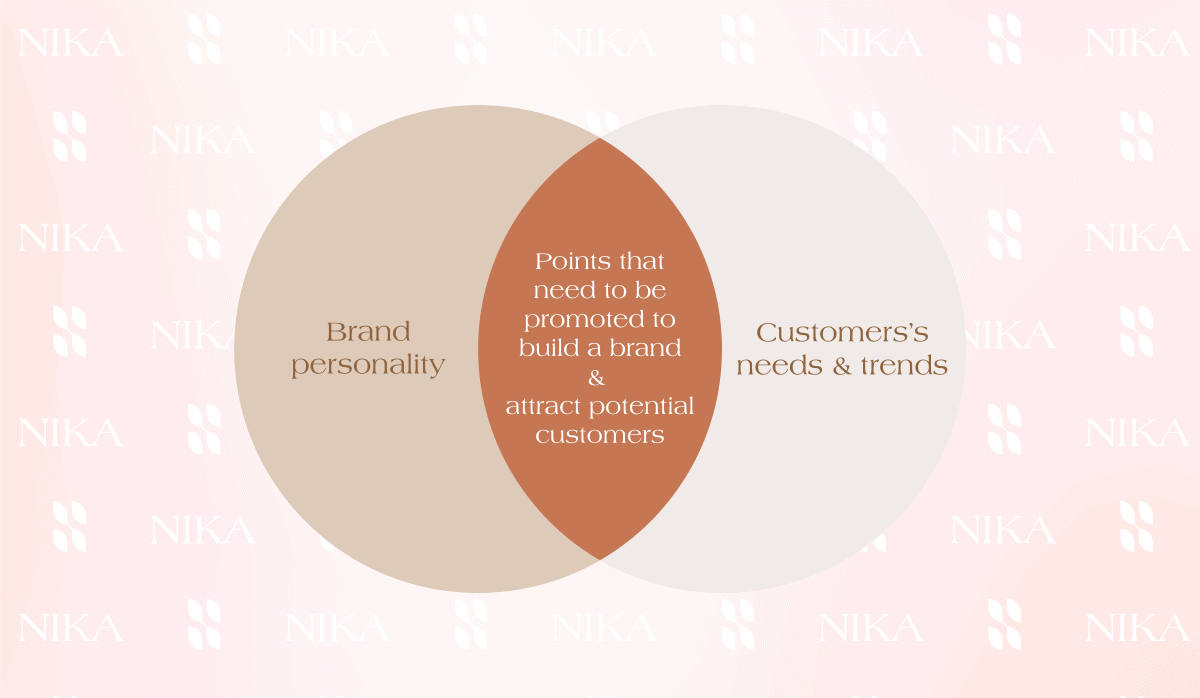
Despite clearly outlining the above goals, like many other SME brands, NIKA still faces the problem of drawing a portrait and core value system of the brand. Although the importance of this action is likened to the DNA of a sustainable brand. The brand’s portrait and core value system will play a vital role as a guideline for all other brand activities, most notably the design of the brand identity system & communication plan
After many consulting sessions and conversations with NIKA’s founder, Gac Sao contributed to helping NIKA better understand its own brand, thereby building everything synchronously and effectively. Now, Gac Sao’s main task really begins: converting the brand’s portrait and values into visual language – a brand identity attracted, memorable and easy to accompany brand to sustainable development
Creative Process
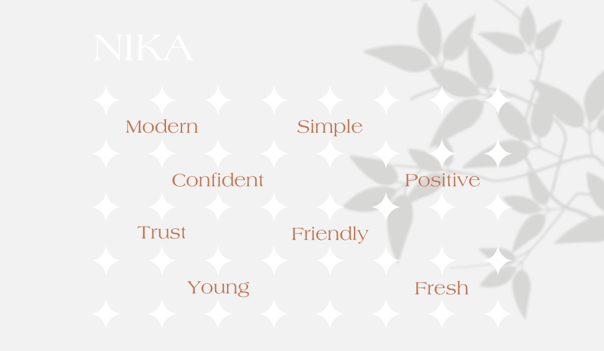
Keywords
Master brief of Gac Sao is a new visual brand identity system that is modern, minimalist but shows youthfulness, confidence and positivity. It will help the brand win the hearts and trust of customers. The new brand identity system must not only help the brand stand out in the competitive market but also be able to exploit the power of brand development.
Comprehending NIKA’s customers
Factly, we realized that the younger generation is the main target audience of NIKA. They are modern people, who focus on not only appearance but also mental health. They believe that truly lasting beauty comes from internal health. They also progress in thinking and perception. The business founder herself is also such a person. Approaching from the target customer’s perspective, we come up with ideas for a new brand image identity design that is modern, friendly, fresh and positive., in addition to expressing the brand’s personality, a good “outfit” will be the most attractive thing to audiences. The “clothes” belong to the brand, but aren’t the people who look at them the most NIKA customers? That’s why Gac Sao focuses on understanding customers’ insights
We realized that the younger generation is the main target audience of NIKA. They are modern people, who focus on not only appearance but also mental health. They believe that truly lasting beauty comes from internal health. They also progress in thinking and perception. The business founder herself is also such a person. Approaching from the target customer’s perspective, we come up with ideas for a new brand image identity design that is modern, friendly, fresh and positive.
Creative Design
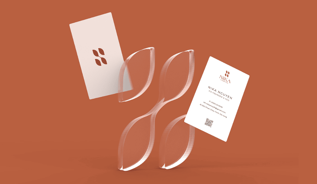
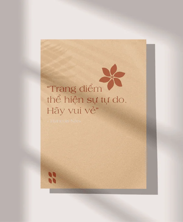
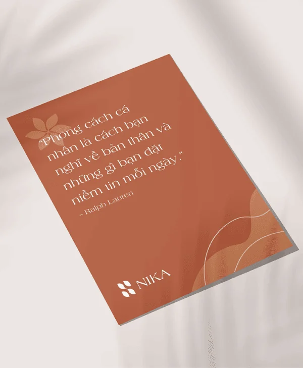
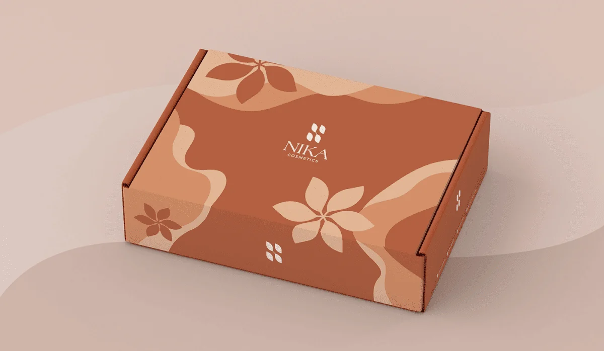
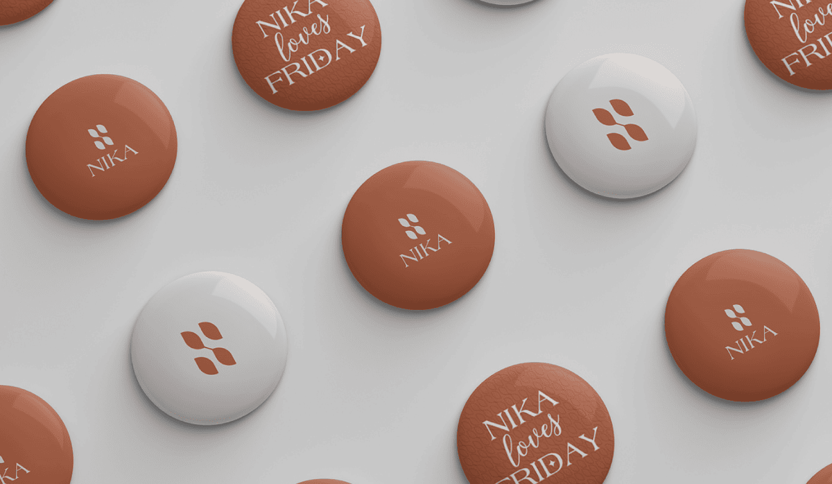
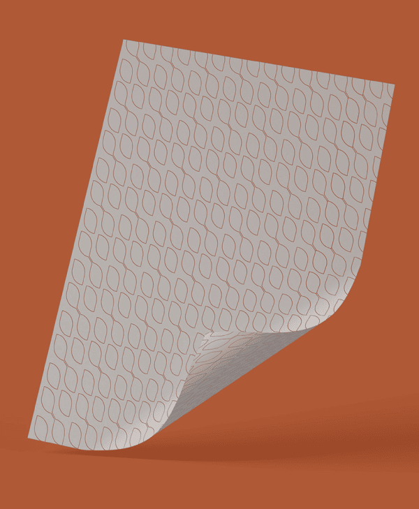
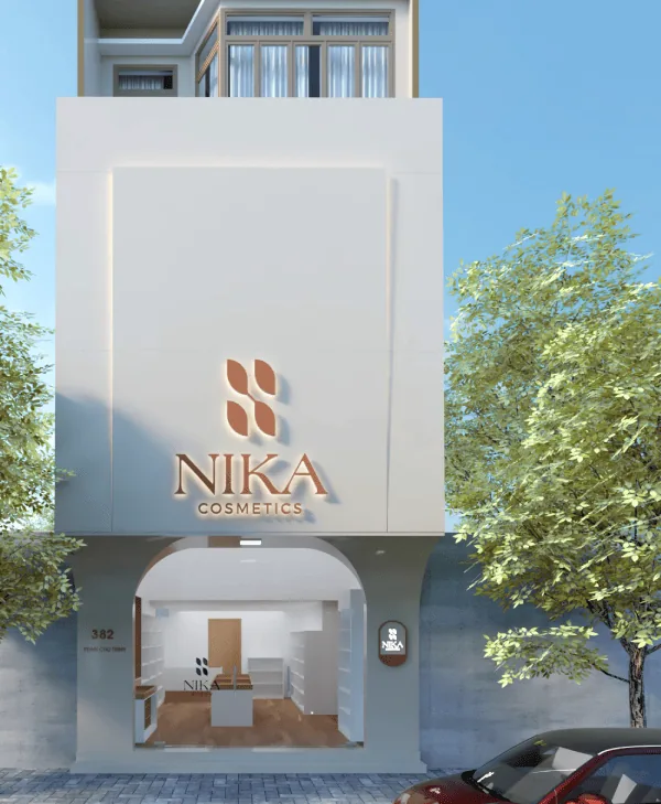
The heart of the brand identity system is the mark. NIKA’s new logomark, was designed by Gac Sao, based on the shape of the letter “N” (the first letter of the name NIKA) and uses the shape of leaves to symbolize freshness and youth. The hyphen between the two leaves also helps emphasize the idea of connection and trust.
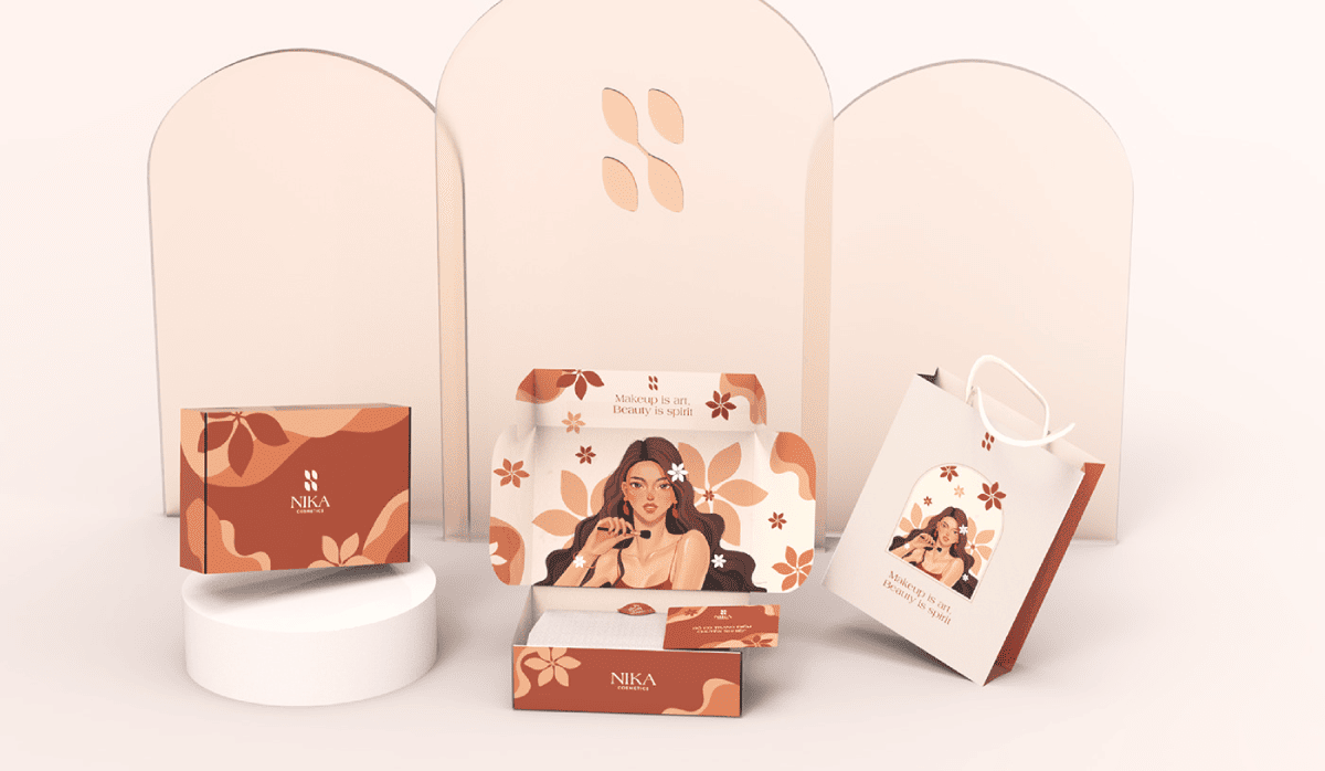
The design system with colors, illustrations, and typography also contributes to highlighting the youthful, confident, positive, fresh and modern.
Results & design applications
Project by Gac Sao Branding
Thank you for watching!
